Monday, March 18, 2019

Vector Illustrated Portrait

Organic Vector

Pre-Production

Image with Posterization
To begin with, we had to choose a subject (family or pet) to do the project on. I chose a photo of my sister, since it had the best lighting, then moved it into Photoshop. In this program, we cropped (8x10in.) and posterized the image so that there were simpler color values to trace. Once adjusting this to make it look natural, we moved the image into Adobe Illustrator to begin the tracing, which would only use the pen tool.


Production

In Illustrator, we had to decide whether to do Organic or Low Poly Geometric. I choose Organic, so after I set up 2 artboards (the first one had a lowered opacity, the other was locked) and set up layers for different sections (eyes, mouth, shirt, etc.). Then came the tracing. This would become the longest part to the project, and often it was difficult to decide what details to include and which weren't worth it. I focused on having a wide range of values, from the brightest lights to the darkest shadows. After a while, I realized that I hadn't closed off all of my shapes, so I went back to correct this and made sure that every future outline was complete. Sometimes, it was difficult to have the pen tool follow what you wanted, but I learned how to edit the anchor points at the end by changing both handles independently.

Post-Production and Final Project

This is the original image along with the finished product. Looking at it now, the face highlight without posterization is softer, though I feel like the exaggerated lighting fits well with vector pieces. In my design, I wished I could have made the hair less "tame" but it would have taken too long to capture every stray piece and I think that would have interrupted the organic-ness of the whole piece. It was difficult to capture the coloring, and I feel as though next time I would've made more shadows. However, without them, the final product has a simplistic aesthetic that I worked hard for, so I believe my balance of details was suitable for this. All and all, I'm proud to see that so many different parts came to make this piece and I will definitely be doing this again some other time.

Monday, February 11, 2019

Typography With Quotes

Typography

Pre-Production

For this project, we had to begin with finding 10 quotes, which would later be narrowed down to 4. I found my quotes by looking at a folder I have on my phone, and then by searching up Bob Ross since I look up to him. For fonts, I wanted to have a mix of Serif/Script and Sans Serif to create contrast within the type itself. I practiced sketching ideas of my 10 to see how they could possibly be set up and this also helped me to find similar quotes to match. 

Production

Once we decided on 4 quotes, we moved into Adobe Illustrator. The file was set up as 5x5 with 4 artboards, and this beginning set would only be in black and white. I tried to arrange my text by importance and weight to draw the eye in order of how you would read it. I learned how to better work with Type during this process, including how to change the kerning and space between separate lines. At this point, we saved and made a copy to begin working with color. On two of mine, I felt that it wasn't necessary to add a lot of color, so I used gray to focus on the value aspect. I prefer working with black and white because though it is simplistic at times, you can carry a message easily.

Post-Production

I feel like the Bob Ross quote turned out the best out of my four. I also like the "Heed the words of" because of the gradient and simple graphics, though next I would make the clouds more cartoonish. I feel like the connotation you get with the words "A Friend" and "An Enemy" really work with the font choices. With more time I would have found more colors for the quote by Yabsira, and the Voids one feels as though it is missing something important, but I liked how I reflected the moons to work with the warping of text. To add onto my favorite quote, next time I would add highlights to the color splotches for dimension and work to make their forms more organic and curving around the text, though I really approve of my choice of font with this one. Overall, this was a good experience to see the other side of graphic design and was needed practice for making items work together. 


Wednesday, December 19, 2018

1st Semester Graphic Design Final Exam

Performance Review Blog

Link to My Behance:

Julia Hester's Profile 


Projects Done this Semester


Raccoon Adobe Illustrator:

This project was to follow a tutorial to begin us using Illustrator in class. It took me 3 days at most to complete this project. Some challenges I faced was using pathfinder to mask and divide objects to create highlights and the design around its eyes. Along the way, I learned to be more comfortable with using a program that wasn't Photoshop or Maya. Some feedback I got while working was to make the bats around the raccoon smoother. My original idea was just a vampire raccoon, but the end project had a pumpkin behind it for a fall theme and bats around him to add on to being a vampire. I really liked this one as it looks professionally cute.
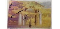

Panorama Photoshop:

For this project, we had to take 10-12 images and combine them into a final piece to tell a story. Mine took anywhere from 5 days to 7 because I worked on the contrast a lot. Some difficulties I experienced were making the images look relatively the same and having the same whitest white and blackest black. Throughout this, I learned how to easily manipulate an images contrast and how to use masks to easily alter them. I got most feedback on the whites/blacks and on the rough or messy edges. I changed my original image based on this feedback, so now the image looks cleaner and is also brighter. My overall opinion at this time was that Photoshop was easy to use and that this could look good in a portfolio as a statement piece.

 Photoshop Tutorial Print:

This project was to turn a previous project you did into a physical print. It was one of the longer ones we did, taking around 2 weeks because we had to do a lot of waiting and cleaning up. Some troubles that occurred was that my other print had bubbles in it so that the print didn't lay even or have the image distributed correctly, but since this is my second one I had fewer mistakes. The only feedback I got was to use more water to finish getting the remnants of paper off. I didn't make any changes compared to my original idea since there was not much to do once the print was placed upon the watercolor sheet. I think this project changed my mind that graphic design was something that is kept on the computers, and I liked that we were able to do something physical in this class.

Time Spent in Class

When I finished early or thought I was done, I either worked on animation or created something in Photoshop. However, mostly I used any extra time to add to my Behance or to add on to the project I finished and revised it to look the best I could make it. I often went back to mess with line art or to use filters/layers to add more depth. Outside of class, I worked with friends to help them with their projects or to work alongside them on ones I hadn't yet completed so that I could get more help or advice myself. In this class, I try to use every second being productive, whether that means completing my project or editing it, or helping someone else with theirs so that I could also get insight into my own. 

Strengths as a Student

My strengths as a student, or employee, include being able to get projects done on time and having them still look good. I am able to pick up on new skills while also improving on what I have done before, so that I am able to look at my past and know how to use it to better my future. Since we have two eComm classes, I know how to move between various programs, from Maya to Photoshop to After Effects to Illustrator. I know the tools well in Photoshop, like using the clone stamp and how to use filters, then I am also able to use the pen tool in Illustrator well to create a clean image. Along with knowing various tools and finishing projects, I also make sure to do the other side of this class by adding to my Behance and finishing my blogs. 

My Ares of Improvement

Though I do talk with my friends about the projects, I am still a generally reserved person to anyone else. I saw this the most when I thought about doing our Open House, but decided against it since I did not feel comfortable with talking in front of everyone. Also, I am always willing to improve with my technical skills, because I feel like I'm still hesitant to use the pen tool in Adobe even though I think my graphics came out nicely, I didn't add on to them more because I thought that I would mess it all up. In Photoshop, I was always nervous to use various masks and filters, so I stuck mostly to just adjustment layer, but I know I need to get better at Selection and editing if I want to continue on the Graphic Design path. I feel like with 2nd semester, I could improve on every area of eComm to become a better student. 

Summary

What I loved most this semester was using Photoshop to edit and combine images. There's just something I like about creating something new from other pieces, and then editing that final piece was relaxing in a way. What I would do differently, though, would be to use less clipping tools because I need to be more at ease when doing a project and not always depend on something to fall back on. Also, I would use Illustrator more often because some days it still feels foreign. My overall take-away is that to succeed in graphic design you will have to know how to quickly move in between programs and that you must have some knowledge on every tool so that you are able to create the best assignment you can. One goal I would like to set for myself is to get 100% on every project and to redo the ones I lose points on. I honestly had a lot of fun in this class compared to e9, and I appreciate the freedoms and work time we were given. 

Sunday, November 4, 2018

Watercolor Transfer Printing Process

Watercolor Transfer Prints


To create these prints, first we had to select which previous project to do. I chose the one above, and then a challenge one, though the previous turned out better so I used only that as a photo. Then, once we got the projects on one document, we printed them out. Before we could transfer the print, we had to get the watercolor part ready. We took a piece of paper, tore it in half at a crease, then began create an abstract piece. One was purple and yellow, and the other was green, blue, red, and more purple. Then, we cut the printed projects in half with a border around the image.

Finally, we were ready to transfer the prints. To begin, we had to put a thick layer of mod podge along the image, being careful not to get any on the body or other side of the paper. Then we laid it upon the dried painted sheet, before smoothing it out with a squeegee to the best of our abilities. Once it had dried for a while, then we used water to rub off the paper. This was probably the longest part, as it took a lot to get all of the paper and fuzz off. Once the image felt smooth, though, a gloss was added as a finishing touch. 

While creating these prints, the part that affected the end product the most was putting the mod podge on. If any bubbles remained, then that would change the image appeared and could have white spots and lines due to it. I struggled with this especially on my first time around, but with the print above, I really improved. What went well for me, though, was getting all of the paper off, since I also worked on it at home. But with this, some of my paint came off, but it's not that bad. Overall, I really didn't expect to have transferring prints be this easy, as I thought it would be some complicated and long process. It was really fun to do, and I think with a third attempt I could have the best print yet!

Monday, October 15, 2018

Printing Processes

Relief Process

This technique involves craving into wood or linoleum so that when ink is applied, the carved areas show up as white space and can either haver grain texture or be a flat black. This skill is needed to easily replicate images with texture or not, and can be used by anyone if not doing it by press when one has a baren. First, you begin by prepping the object with ink so that you may have a background to tell what is happening. Then you transfer the drawing onto the wood, and either use black line or white line composition to create depth. Once the image is cut into the block, it is ready for ink to be rolled over the surface, then put onto a press to transfer the design to paper.  With linoleum, you can use a marker to draw onto the block, and then carve the soft material out, and with this medium, the black is very flat and has no wood grain texture.

Intaglio Process

This technique involves scratching or moving of material on a flat plate, such as copper, to create wells for the ink to settle in. This is a direct opposite to the process above, but is also used to mass produce items, but would be less common as it required access to metals so more popular artists would use this method. You begin by using a variety of tools to create texture on a surface into your desired design. Then, you must soak the plate, wash it, and soak it once more. Once this is completed, you polish and clean it to begin etching, which begins by preparing the ground. Then, you smoke it to create a black surface, and scratch the ground off to reveal the copper beneath. The plate is then put into acid to create the spots for ink to sink into, and is then cleaned for printing. First, you must put ink along the surface then wipe off the excess. A dampened piece of paper is laid on top, then felt is rolled over the sheet and paper to transfer the image.

Lithography Process

This technique involves using a lithographic stone that is both receptive to water and grease, so the grease is the drawing that can be removed with various items, and this printing type is very delicate with its surface. This would be used for printing posters and other pages requiring words, and would be used for those in the writing or news business. The grease is made with either lithopencils or lithocrayons, and is done directly onto the stone. There is a first etch, then rosin and gum arabic is applied to the drawing. TAPEM is applied next to help keep the gum to the stone, and the gum itself is added again, and the whole drawing is buffed. A greasy solvent is placed upon the drawing, making it "disappear," to act as a base for the ink, which is applied after wetting the surface. For printing, ink is first forced into the crevices, and this is down multiple times to gather a full print from the stone, but this also creates a realistic look of each newsprint being hand drawn.

Summary

The printing process I would like to attempt the most is Relief. I feel as though this would be the easiest one to do in a school setting since we don't need a press to do it. Also, I have always wanted to do wood carvings since I tend to be a very nature centered person. I think these older printing processes have affected contemporary designers by allowing there to be ways to print cheaply and have the methods be widely available. Also, this allowed for us to mass produce designs, such as t-shirts, and not create the same thing over and over. Overall, it allowed for more colors and mediums to be introduced into printing, and made the printing itself more commonplace for artists.

Thursday, October 11, 2018

Multi Exposure Panorama

DC Panorama


Travel

At the beginning. we passed over a calm river to reach the destination of our 23 bus ride: Washington DC. On our way to a hotel, there was a building that reached up into the heavens, a sight that we would see nearly everyday. The altitude was different here, the air felt lighter but with the amount of plants and trees, it felt more invigorating. Breathing in welcomed the strong scent of rich earth and aromas from various food trucks and restaurants nearby. I had never seen a city so cultured and so different around each corner, people talked in more languages than I could imagine and they were selling everything from around the globe. 

During the middle, we spent most of our time visiting monuments and museum. There was always another building close by that beckoned you to explore it. One of my favorite places to see was the Botanic Gardens, which I know isn't some fancy, towering building with more history than some states, but I felt alive with all the growth, and how they had everything from desert cacti to tropical trees. Don't get me wrong, I feel more knowledgable visiting national museums that taught you everything from art history to NASA, and I will forever keep close the awe I felt when I saw the founding documents. At the end of each adventure, we'd return to what would become our home, safely protected by a stone lion.

The end came with after our parade. The parade itself was through bustling streets, and I had difficulty breathing in the heavy, humid air. But we all pushed through the landmarks and smoke left over by the motorcycles are few hours before. All I could focus on was making it to the end, even though I dreaded leaving the mountainous, lush green region to go back to flat, yellow Kansas. Then, it was over, and I chugged down a water bottle, which had become the sweetest thing in the city to me. The bus ride back to the hotel was quiet, all of us satisfied with completing our main goal for band. Soon after. we began another day long ride, leaving over that calm, shimmering river. 

Reflection

First, I had everything in black and white so that they could have a shared mood. I edited the contrast balance so that the images might have a dark black and a bright white. I kept color in what I felt had the most impact on people, which in the end was the colors red and gold. The 2 rivers were both put down as the background, one at night and on at day. The tried to have the buildings show up in the order that I saw them, and had the ones I saw the most in the middle and on the left side. I wanted it to appear as though they were right by each other, without having hard lines and by deleting the backgrounds. I feel like the little bit of color represents what the city itself tried to make the most important, having a strong historical/political background. The buildings were either in the background or the foreground to keep it consistent. Then, extra items were put along the middle. The emotions were mostly awe of the monuments, and a sense of wonder. Overall, I tried to make it flow from the beginning to the end, to have that sense of Travel through DC, and to convey what I felt along the trip. 

Tuesday, October 2, 2018

Photoshop Pop Art

Pop Art


For this project, I was partners with Audrey Young and had her as a subject to create pop art. To begin with, I cropped out the background so it was only her and then made it into black and white. With the background, I tried to have the repeated circles of Roy Lichtenstein's comic style, and also made it cool colors to add further contrast with the bright, warm triangles and horns. The is some influence of Warhol with her inverted image, so that the subject is also repeated. I tried to have it be flashy like theirs to balance out the black and white adjustment mode. 

Over this adjustment mode, I used some layers with the Color blending mode or Overlay blending mode to retain the feel of the original image, just with some Pop! The main filter that I used for this were the Blurs, seen with the inverted subject and then the triangles. There were many masks to keep the desired effect in a specific area and to add back color. I wouldn't say I have a true color scheme, just various forms of warms with cools, so almost complementary colors, and then there is contrast with the black and white focus.  I would say I was effective in creating my design, as I was able to easily add and take away additions to her, and had a lot of freedom in what I wanted to do.